Producing the perfect horse listing is hard — we get it. In our years of putting together the ASPCA Makeover Marketplace catalog and approving ads for our exclusively Thoroughbred horse listings, we recognize that it can be difficult to portray exactly why your horse is the dream next partner for shoppers — and we’ve noticed a few of the same horse listings pitfalls coming up over and over again. Here are a few strategies to make sure you can avoid those pitfalls and make your listing work hard for you!
Pitfall #1: Repeating in the written description what’s already in the listing.
Thanks to the RRP’s unique listing system and hardworking staff members who verify information, RRP horse listings and the Marketplace catalog will automatically pull a horse’s bloodline information and racing career notes, plus link to Equibase. Also note that you’ll be filling in fields such as height, gender, and color. That means that you DON’T need to repeat this information in your written description, unless there’s something specific in the bloodlines or racing career that you want to highlight. Save that limited space to share information about your horse that we can’t already get from the listing information: training or competition achievements, outside-of-the-arena training or achievements, or what sets this horse apart to shoppers that’s discipline- or career-specific.
Pitfall #2: Listing information doesn’t tell a cohesive story.
While you don’t want to repeat yourself, your written description should back up the level of training and potential that you highlighted in those listing fields. Whether you’re selling a prospect fresh off the track or a seasoned competitor, make sure the training status and your written description are telling the same story: a horse that’s never been off the property is unlikely to truly have local competition miles, as an example. The same goes for selecting potential: it’s tempting to check all of those boxes and try to reach as many horse shoppers as possible, but if your horse isn’t going to be a good fit for a particular discipline, you’re not doing him any service by claiming otherwise. As an example, your leggy 17.3hh gelding is probably not what most polo shoppers are going to be looking for.
Pitfall #3: The listing and the visuals don’t match.
Allow us to borrow an idiom, with a horse listing twist: don’t let your ad write a check your photos or videos can’t cash. If you’re stating your horse has achieved a certain level of training or competition achievement, you should have photos, videos or a publicly-available show record to back that up. Claiming a horse is a seasoned competition veteran without furnishing records, competition photos, or videos feels a bit like a bait and switch to shoppers.
This applies to horses schooling at home, too — if you’re stating that a horse is loping the barrel pattern, schooling up to 1.0m, or trail riding around the property, you should have some visuals (photos or videos) to demonstrate these skills to shoppers. Horses in initial retraining after retiring from racing should show three gaits under saddle and whatever introduction to discipline-specific skills you’ve started.
Pitfall #4: Poor-quality photos for a high-quality horse.
If you’re asking a five-figure price tag for your horse, invest in some good-quality photos! Nothing says “I don’t take my pricing seriously” like a blurry screenshot from a smartphone video for a horse being marketed as having true upper-level potential. That doesn’t necessarily mean that you need to invest in a professional photo session (although that never hurts), but you should be prepared to invest some meaningful time in capturing conformation, personality and discipline skill photos and videos for your animal if you want shoppers to make the investment.
Need some help capturing good-quality conformation photos? Here’s our favorite guide — and read on for some examples of good vs. poor conformation photos.
Pitfall #5: Not recognizing a poor conformation photo.
Conformation photos remain the evergreen standard for horse listings: when done well, they present the horse as a sport candidate and let shoppers see how a horse is put together, and how that build could work in their discipline of choice.
Most guides to taking conformation photos show you plenty of good photos, but it can be helpful to look at some not-so-great photos side-by-side with good ones to help train your eye to recognize problems. We’ve collected plenty of examples below, taken with both good-quality cameras and smartphones!
Stance
Thoroughbreds (and most breeds, truthfully) are “stood up” for conformation analysis with the legs closest to the camera square and balanced beneath the horse, and the legs furthest away are offset to allow the camera to see all four. The far front leg should be slightly back, and the far rear leg slightly forward.
It can be difficult to get the horse to stay in that stance for long, so many sellers snap a photo or two and think “good enough.” Here are some examples on how a “good enough” but not great photo can make the same horse look very different:
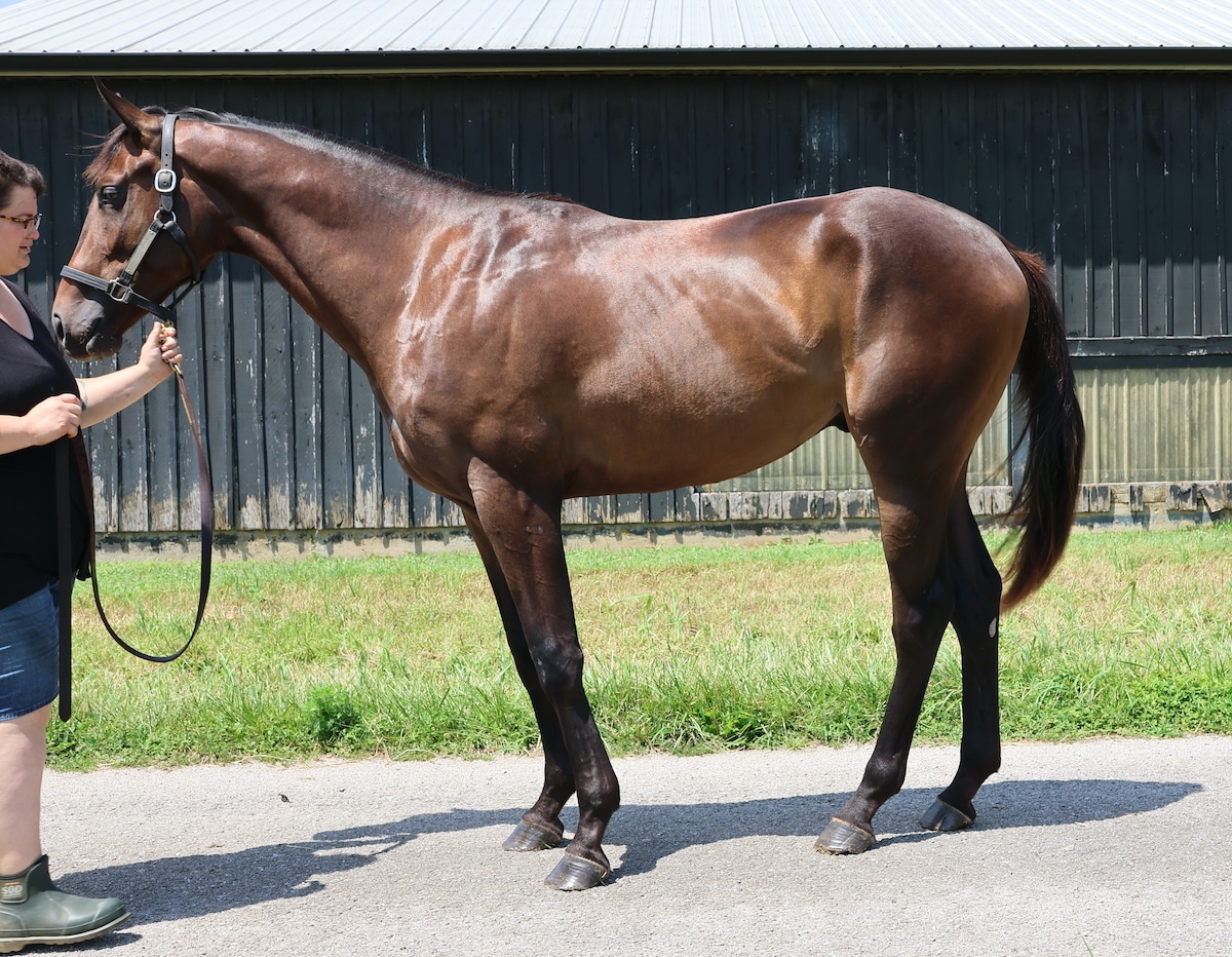
While you can technically see all four legs on this horse, they are camped far beneath him and he is not standing balanced or square, giving him the “elephant on a pedestal” look. This can give the impression of hoof pain and overall poor posture. (In a perfect world, the handler would also be out of the frame.)
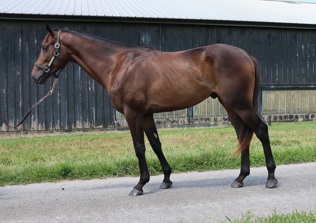
This is marginally improved from the last photo, but this horse now looks like he’s leaning forward, giving the impression he may be heavy on the forehand and unbalanced as an athlete.
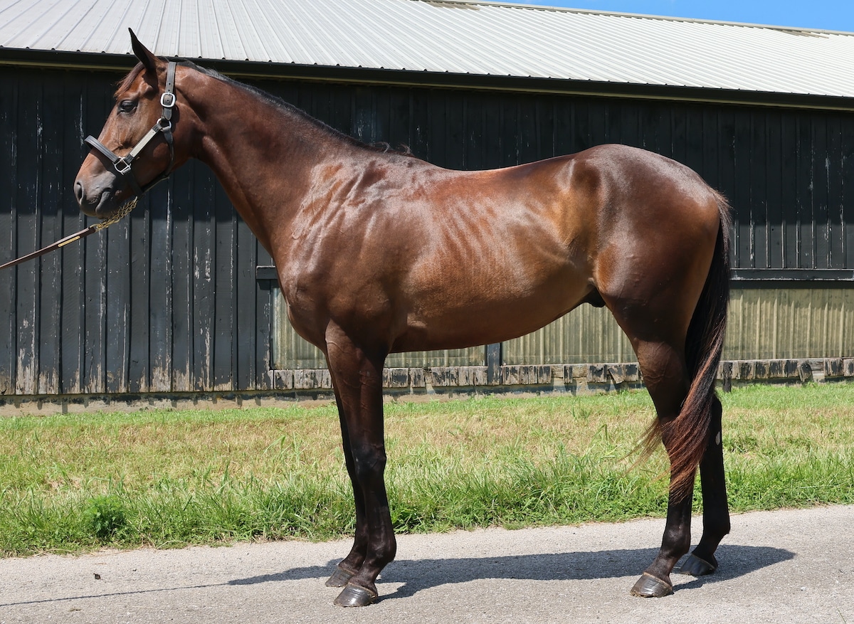
While the horse is now more balanced, his legs are “stacked” so you can no longer get a good look at all four. This would be the best “good enough” photo from this angle, but still is not ideal.
Can you see the difference between these photos? Here are a few more looks at the same horse in a different location on the farm.
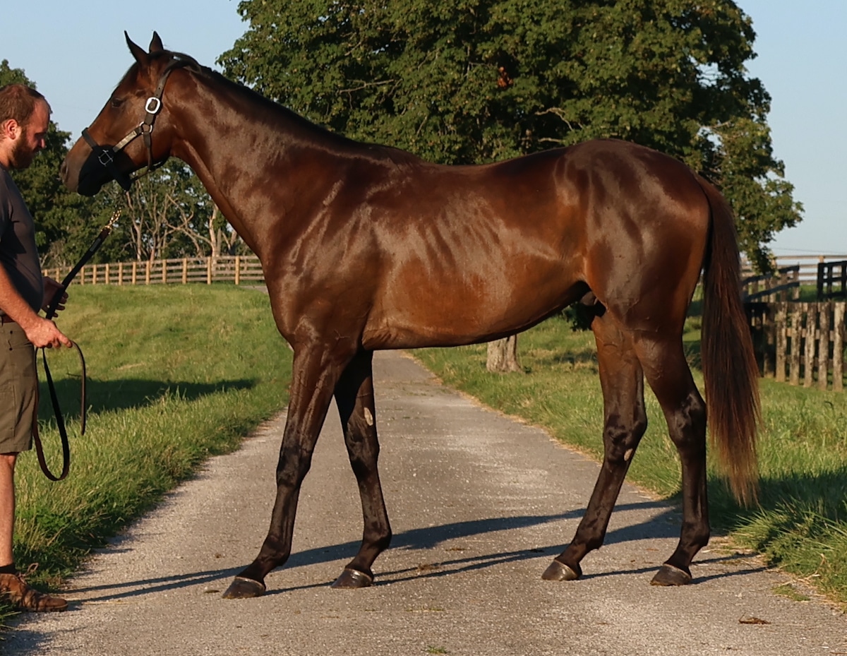
The horse is leaning back in this shot. If this shot was selected as the best of the bunch for conformation, you might wonder if the horse was sore and trying to rock his weight back. (There’s also a shadow being cast by the handler onto the horse’s face, which is not ideal.)
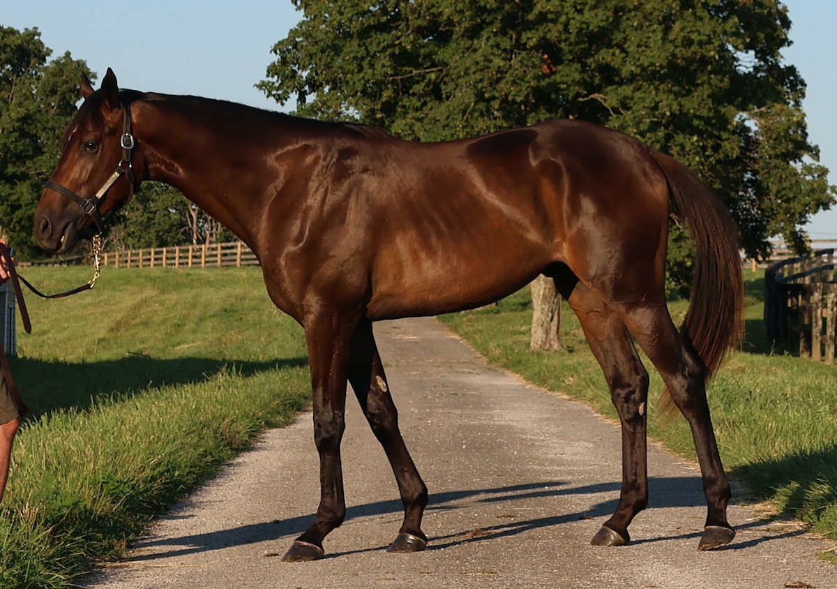
Now the horse is back to leaning forward again, looking almost like he’s lunging onto his forehand. In fact, the left hind is starting to come right off the ground.
For comparison, here’s a good example of a balanced stance by the same horse that puts the weight over all four legs, plus captures some expression in the horse’s face.
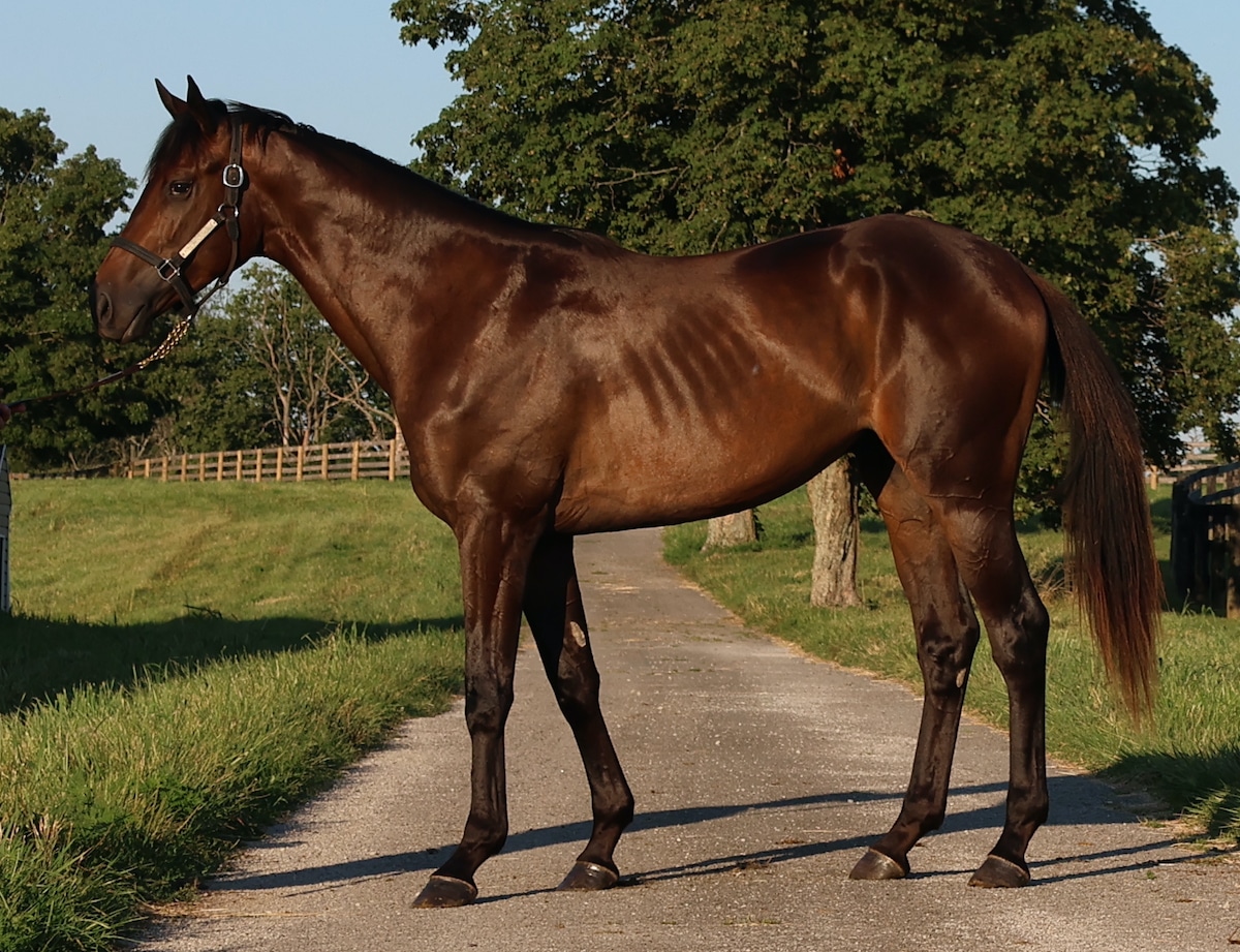
At last, we’ve landed on a good balanced stance. It may be fairly subtle from the last photo, which illustrates how many shots it may take to get the perfect conformation photo!
Angles
This is one to pay particular attention to if you snap your conformation photos with a smartphone. Smartphone cameras have come a LONG way, and it’s possible to get decent photos for horse listings with one, but you need to pay very close attention to your angles — because you typically need to be much closer to your subject with your smartphone camera, it’s easy to get that angle too high or too low and distort the look of your horse.
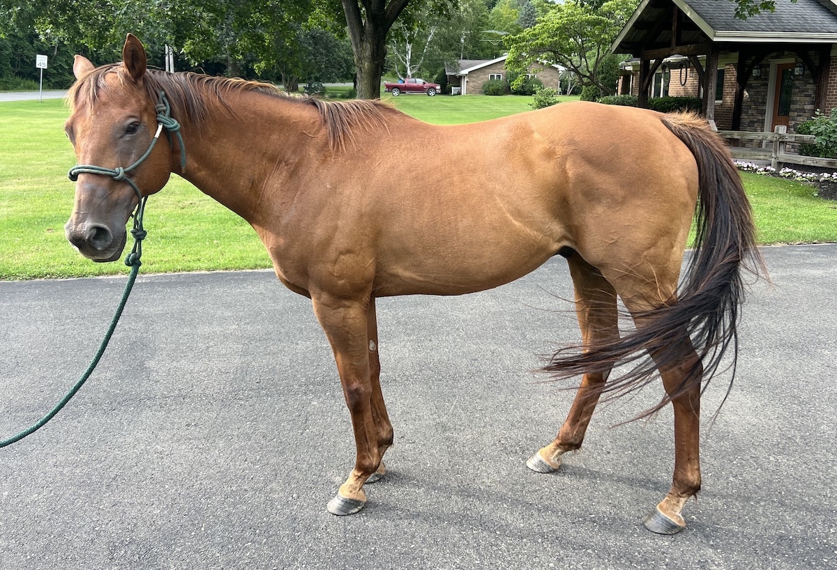
This is the kind of short-legged, big-headed look you’ll achieve with your smartphone camera if you’re shooting too high looking down at your horse. This is not a very flattering shot of an otherwise not-unattractive animal.
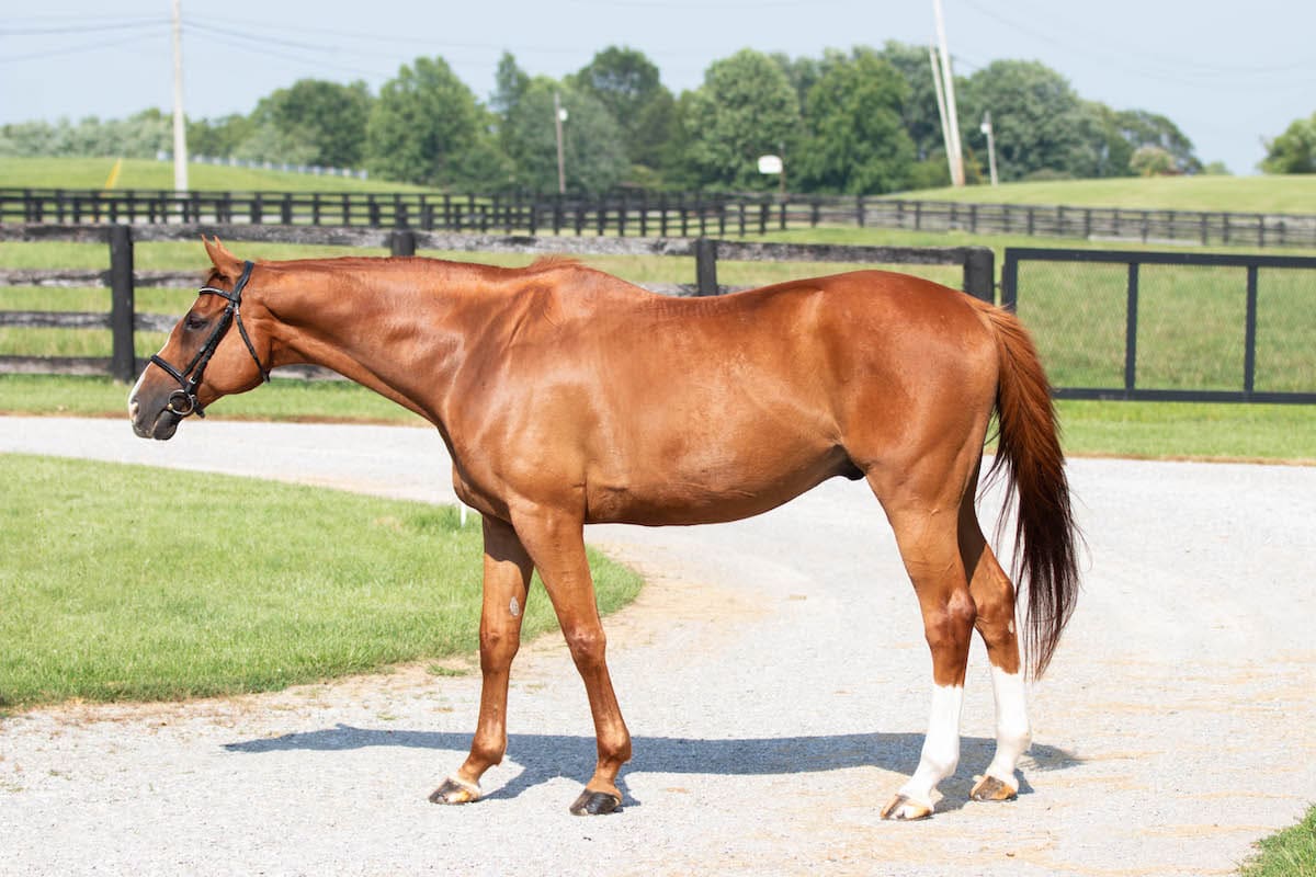
Here’s the same attempted shot with a good-quality camera. The photographer was standing on a ladder to try to achieve the same look as the above smartphone photo, but the long focal length covers some angle sins.
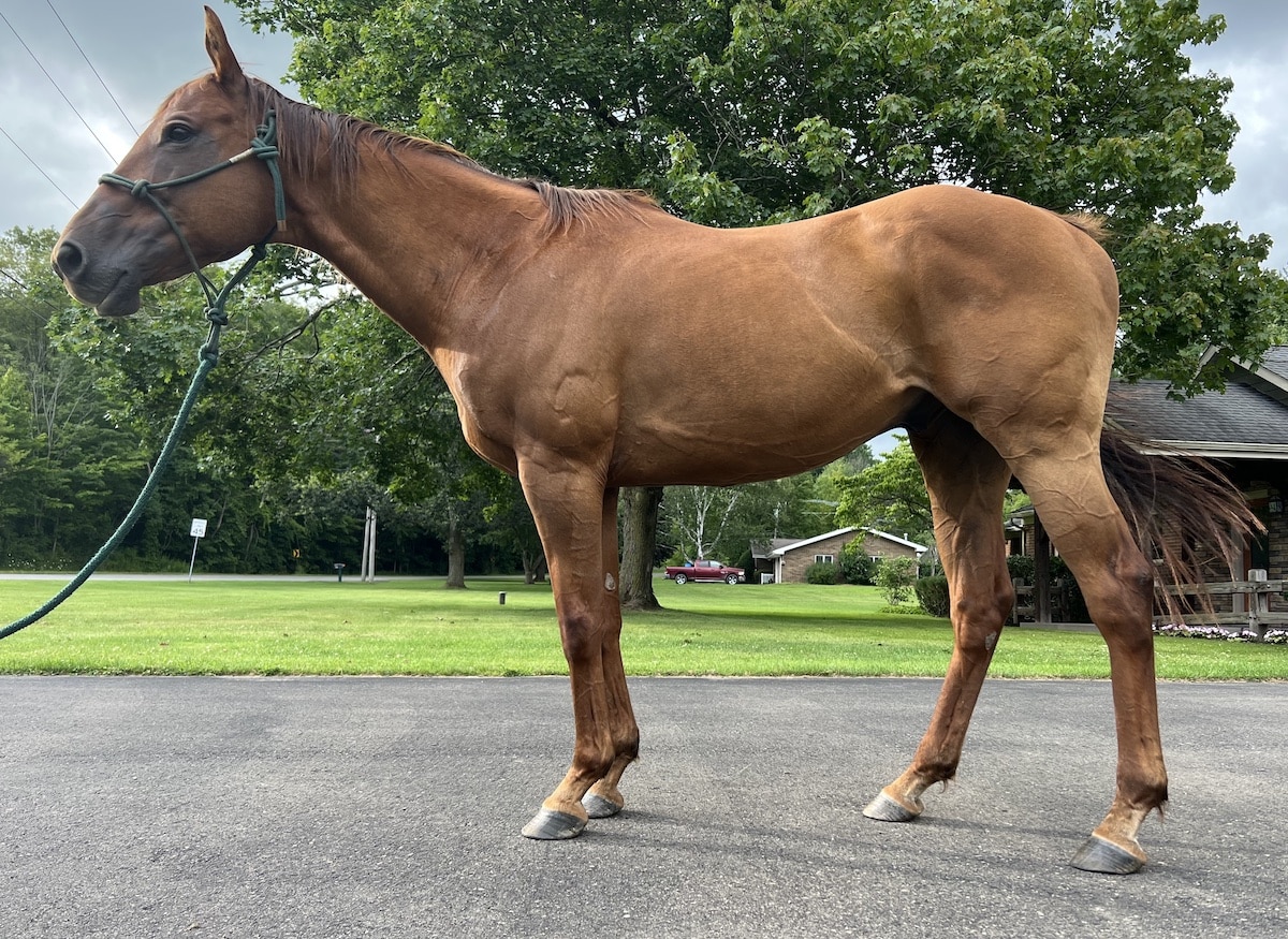
A similar effect takes place with the smartphone photographer too low looking up at the horse. This animal looks disproportionate, and with his head slightly turned, it looks too large for his body.
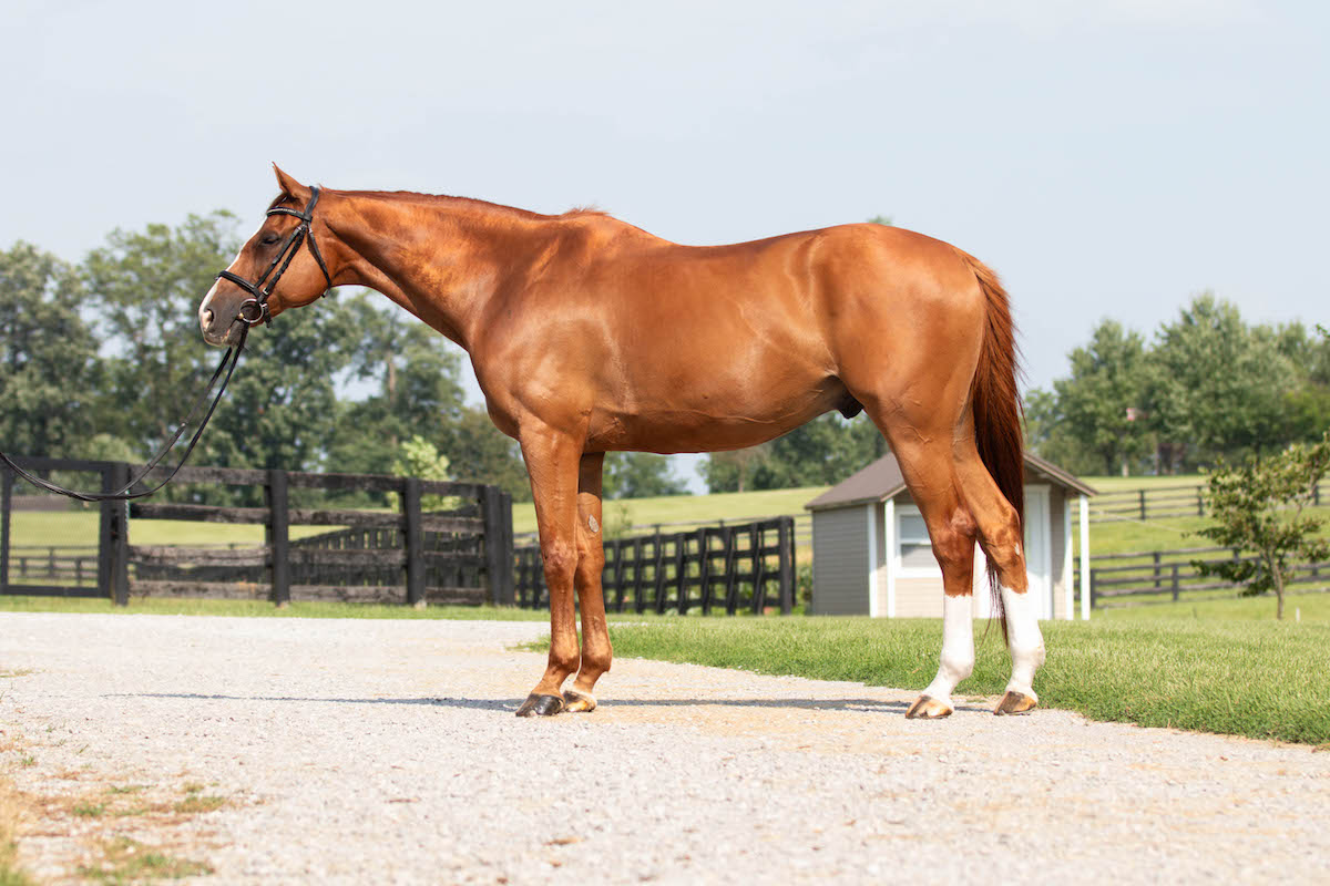
Once again, the focal length on the camera manages to pull off this shot, taken from ground level. Seeing the difference?
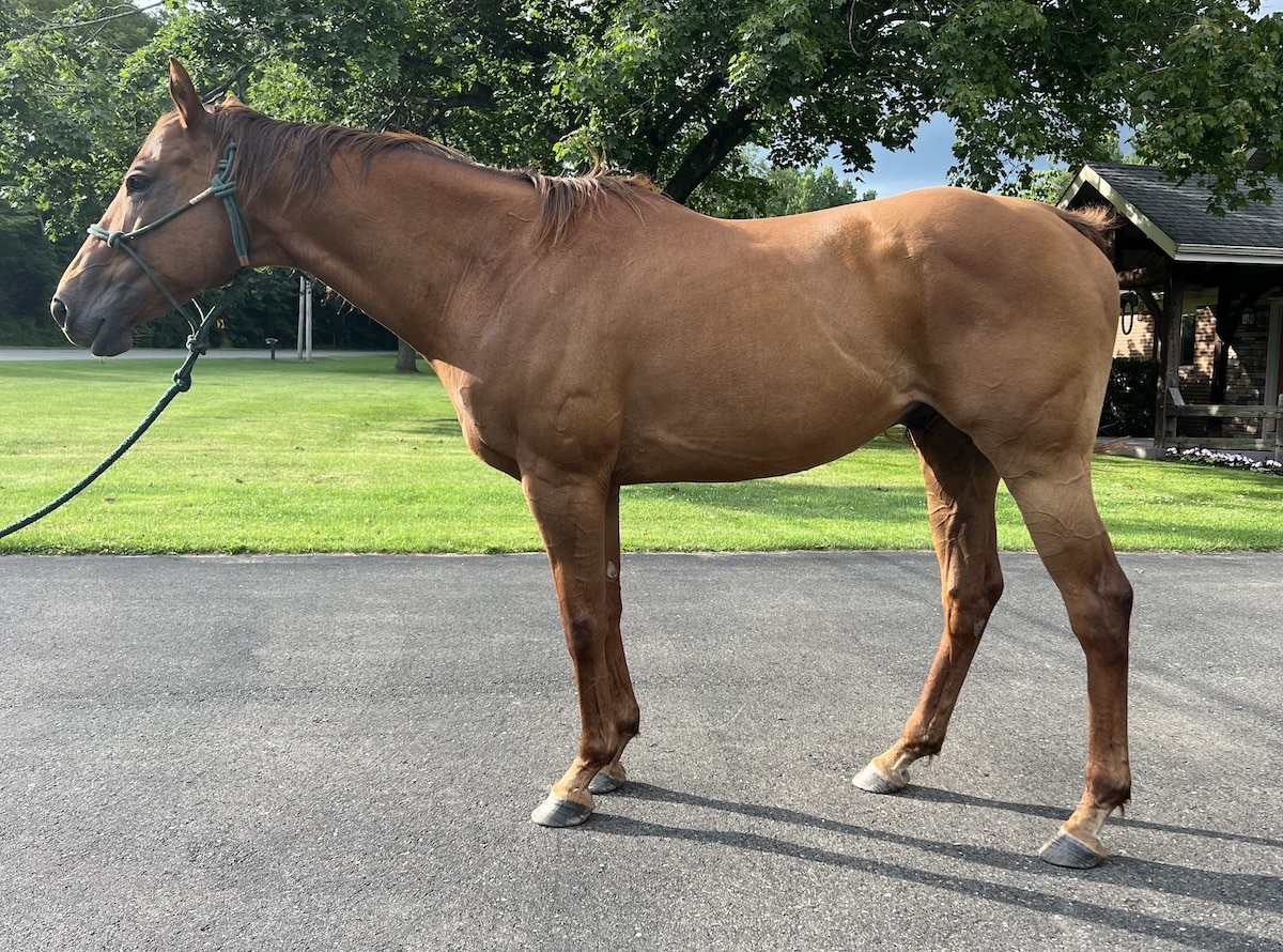
While still just a quick smartphone shot, this photo is taken at the horse’s ribcage height, making him much more proportionate and showing an accurate look at his conformation (although he’s not stood up properly to get a good look at all four legs).
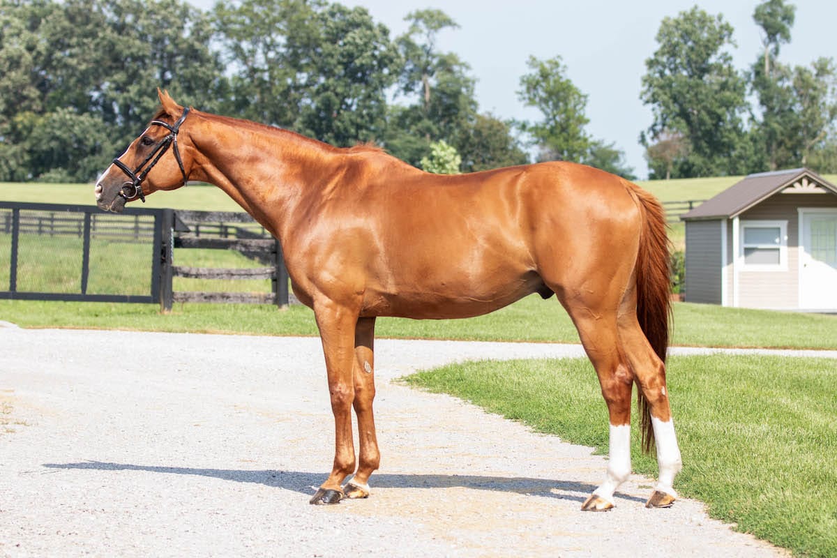
And of course, the good-quality camera with the well-turned-out horse captures the winning shot.
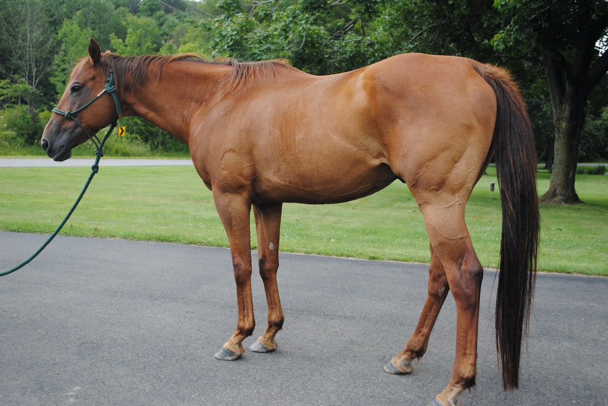
Other angles to avoid: the awkward “booty shot” that might flatter a horse with a big hip, but doesn’t allow the shopper to truly look at a horse’s conformation.
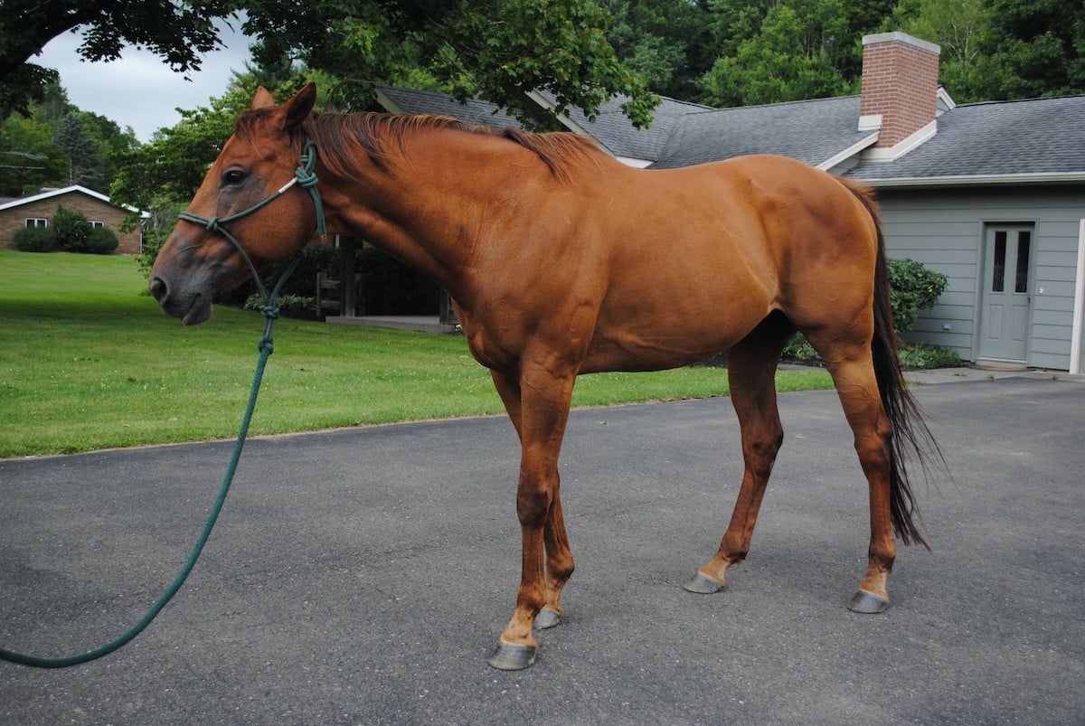
Even less flattering is the 3/4 front shot. Shoot your conformation photos square from the horse’s ribcage.
Detractions From the Overall Image
There are a few “worst practices” that can make a listing fall flat and make an otherwise top-dollar prospect look like an afterthought. Here are a few looks to avoid when capturing your photos:
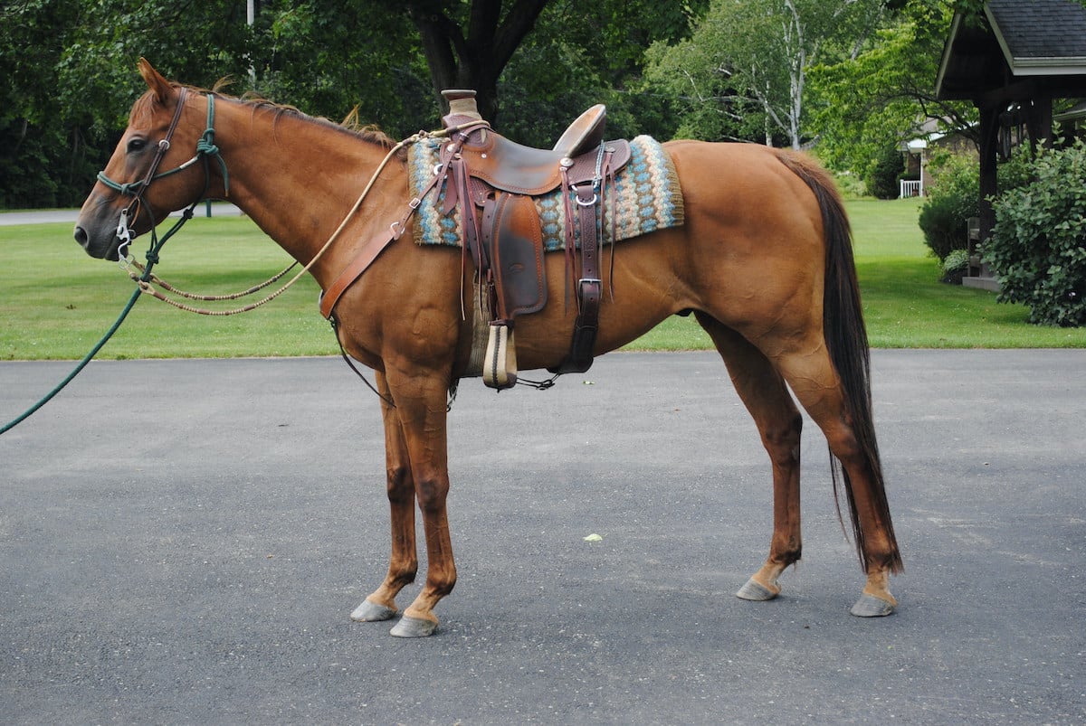
A tacked horse feels like the seller is trying to hide something, like a weak topline or an underweight animal. It also prevents the shopper from picturing the horse in a discipline other than its tack suggests.
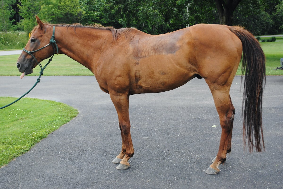
Nothing says “my conformation photos are an afterthought!” than taking them after a ride when the horse is still sweaty!
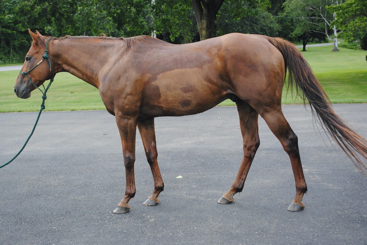
The same goes for the post-bath photo. Bathing your horse for your conformation photos is a great choice… but wait for him to dry fully!

